Charley Harper at Castor & Pollux until 5th September
Fri 13 Aug 2010 by Emma_McCann
I'm sure you've all already been down to Castor & Pollux to take a look at the fantstic Charley Harper Summer Show, but just in case you haven't, check out this great aricle on the man himself written for C&P by Delicious Industries:
“I don’t try to put everything in, I try to leave everything out. I never count the feathers in the wings; I just count the wings.”
Charlie Harper was an American Modernist who developed a distinctive style of illustration that he called Minimal Realism. Harper grew up on his family’s farm in the Appalachian foothills where he built “an affinity for nature that would one day find expression in my designs”.
He began studying at the Art Academy of Cincinnati as a realist painter before being drafted, spending three years in Army Intelligence during the Second World War. Harper continued to sketch, however, and in this very different environment learned how to “grasp the important elements of a scene quickly and put them down with minimum detail.”
After his time in the Army, Harper completed his studies and graduated in 1947. He was awarded the Stephen H Wilder Traveling Scholarship, which enabled he and his wife Edie to travel the West and South of America painting and enjoying nature.
On their return Charley became a tutor at the Art Academy of Cincinnati (where he would stay for 20 years) and also began working in a commercial studio. However, he soon found the latter wasn’t an environment for realism and that all they wanted was illustrations of “happy housewives”.
Increasingly frustrated with the limitations of realism he began to experiment with a new style where he replaced perspective with two-dimensional shapes, reduced to only straight lines and curves. The idea was “…to push simplification as far as possible without losing identification”. This new style combined the ability to caricature and simplify.
“I reduced all lines and edges to straights and curves and began to render with mechanical drawing instruments - ruling pen, compass, French curve, T-square, triangle. I saw forms as hard-edged shapes of flat or textured colour with enough lines added to complete identification. I began to include black and white in every full-colour picture (forbidden in realism); spanning the value scale added sparkle and zip, and all colours seem to me richer in the presence of black and white. I didn’t discard depth, but achieved it by such devices as overlapping shapes and colour and size relationships.”
Harper’s use of pure ink whites rather than unprinted paper is one of the reasons why his prints still appear so vibrant.
“Nature subjects, I found, are ideally suited to this interpretation. Birds and fish in particular have built-in functional beauty imposed by their habitats and require only a little distortion of what’s there already, a thinning of lines and a simpler statement of shape. In perching and walking birds, and some insects, there exists a spatial tension because of the heavy body supported by slender legs that I find satisfying.”
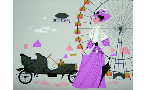
In 1948 Ford Publications commissioned Harper to illustrate the recipe section in the December issue of ‘Ford Times’, Ford Motor Company’s travel magazine. This was the start of a successful collaboration that would last until 1982 and the reason that so many of the wonderful prints we know today exist.
His illustrations proved popular with readers, who often requested copies. So in 1952 the illustrations for a wildlife article, ‘Eight Familiar Fish’ were also offered to readers as a series of screen prints for $5 each. The prints were hand-screen printed by Charley and Edie in their basement - Charley created the stencils whilst Edie mixed the inks.
These limited edition prints were so successful that in June 1953 a second set followed concluding a series of articles named ‘Horseless Carriage Adventures’ and depicting national landmarks. Then in November 1954 a series of bird prints were offered which accompanied the article ‘Feeding Station Birds’.
The bird prints became an annual tradition eventually comprising 73 designs. For each November issue Harper would not only illustrate an article about birds and produce the limited edition prints but would also write it. In total, he illustrated over 90 articles and 30 covers for Ford Times.
Throughout the 50’s and 60’s Harper enjoyed commercial success illustrating the popular cook book, ‘Betty Crocker’s Dinner for Two’ and being commissioned by The Golden Press to illustrate ‘The Golden Book of Biology’ and ‘The Animal Kingdom’, all very sought after publications.
Harper found the greatest pleasure in nature illustration and throughout his career designed many posters for non-profit organisations including Cincinnati Zoo, Cincinnati Nature Center, Hamilton County (Ohio) Park District, the Michigan Audubon Society and the Hawk Mountain Sanctuary in Pennsylvania.
Other notable works include the design of two ceramic tile murals both in Cincinnati; one for the Federal Building, based on American wildlife and one for the new Convention Center, titled ‘Space Walk’. Also two painted murals in Dearborn; one depicting Michigan wildlife in the Ford General Staff Office building cafeteria, and another on ‘transportation around the world’ in the Ford Rotunda.
C&P have informed us that the Harper originals have all but sold out, but there are still plenty of books, prints and posters available. Check out the C&P blog here with images from the show.
Charley Harper
Runs until 5th September
Castor & Pollux
165 King's Road Arches
Lower Prom
Brighton
BN1 1NB
(01273) 773776
Categories
Tweets from @bigillustrators and friends
News archive
- 2019
- 2018
- 2017
- 2016
- 2015
- 2014
- 2013
- 2012
- 2011
- 2010
- 2009