Meeting Report: 6x6 25th Feb 2010
Tue 02 Mar 2010 by Belen

The first half of this month's 6x6 evening got off to an interesting start with Vicky Woodgate, Mark Taplin and Karen Donnelly.
Vicky took us swiftly through her first ten years running a successful scene design company, employing up to ten people. Fed up with the mucky work and the rigours of working on such large scale murals, Vicky decided on a life change. In 2003 she brought a Mac, learnt how to use illustrator, and moved to Valencia, Spain. Her first commission in her new medium was a challenging beach scene for a German client. She did not find the change of scale in her work too much of a problem and Illustrator allowed her to work in a style similar to her previous murals.
A personal project on the theme of bearded ladies led to more work, but Vicky felt out on a limb working in Spain and that clients were too partisan in their choice of illustrators.
Back in Britain, a new agent and a commission to build a bank of portraits has kept her busy. One of her most striking portraits being of Amy Winehouse. This led to being included in American Illustration 29, which in turn has led to more work. In order to keep sane, Vicky pursues her own personal work which includes humorous drawings of animals. She is also venturing into Photoshop and is keen to explore what it has to offer as a contrast to working in Illustrator.
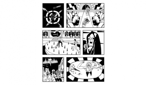
"If an illustration makes me giggle, I've achieved part of the process," claims Mark Taplin. He also cites childhood memories as important inspiration, "Trippy visuals from childhood" and films such as Tommy and especially Flash Gordon. This last film such a significant father-son bonding experience that it has become a deeply mined shaft of ideas; his six chosen slides all referring to the film in some way.
Mark is a busy illustrator, but mainly an animator working for Abbey Road Studios, MTV, the BBC, and many others. He is with the Rush Agency. He extolled the virtues of doing charity work, (UNICEF), as you are left to your own devices and often leads on to other worthwhile work. Mark's work is full of dark humour and his presentation was very funny and enjoyed by the audience. He finished off with a tribute to the soundtrack of Flash but not before giving us all good advice on the future importance of animated illustration on the website and electronic books.
Karen Donnelly works mainly in publishing, illustrating books for the pre-teen 8-13 age bracket. Her strength lies in line work. She enjoys drawing people, characters and telling stories. Her drawings are elegant and look deceptively simple. Whilst sharply capturing the essence of a personality, they seem to retain warmth and tenderness and make them ideal for children's books.
She has illustrated the Josie Smith stories by Madeleine McNab and also stories by Jean Ure which deal with contemporary issues. Karen was broken hearted when this work came to an abrupt end, but a commission to illustrate six Dickens classics proved a very enjoyable job. Karen, a keen reader, re-read the books which helped her bring the characters to life.
An advertising campaign to raise awareness of services for elderly people brought new challenges which included a drawing of a senior citizen changing a light bulb and an anxious observing pet dog, wondering if its master's time was nigh!
After the break Peter James Field, Neil Gower and Rory Walker were up.
Peter looked harmless enough; softly spoken, first slide perfectly respectable, a page from his daily visual diary (one simple line drawing a day, sometimes a bit of colour, a simple caption). I was just about to press snooze button when slide number two appeared, entitled Saliva Tree. Peter continued in his gentle way to explain the nightmarish concept of his drawing: we are all possibly six snogs away from a Z-list celebrity. The research and fact checking required to create this work is not for the faint hearted and it was clear, Peter was not what he appeared...
Left to his own devices, Peter would be happy creating his books which seem to catalogue dark and troubling subject matter in a cool and almost forensic way. He makes weird connections, for example the chilly portraits of serial killers and the number of victims they have each murdered. This contrasts uncomfortably with portraits of pop stars and the number of hits they have had. Another book catalogues lovingly rendered used pill packets.
Away from his intriguing and darkly humorous personal work, Peter's colour pencil work is in demand. A skillful composition of a crowd of people traversing a level crossing is given a strange atmosphere by the keen observation of light and shadows.
To avoid being type cast in this sort of drawing, Peter is developing his style using the computer. He is aiming for looser drawing but his subject matter seems to remain contemporary in its fascination with violence and banality. Peter treated us to a You Tube snippet of his work being featured on Loose Women: http://www.youtube.com/watch?v=ddhDx56Opho
In complete contrast, Neil Gower presented his six slides. He stated that he does not have one particular style. However, whatever style he works in is beautifully done. He is a highly skilled illustrator who has not resorted to the computer but still produces original art work.His book jacket for the 50th anniversary of Lord of the Flies, inspired by Aboriginal art work, won Book Jacket of the Year Award.
Neil has carved a successful area for himself in picture maps. He loves doing them and it shows. Roy Strong commissioned one of his house and garden and Neil gave fascinating tips on ways around composition problems when there is no ariel view available. Other notable clients have been Conde Nast in New York, who commissioned an exclusive project with Neil and a writer. This involved a nice jolly in Naples.
Locals will be familiar with Neil's covers for Lewes' Viva Lewes magazine. Neil confirmed what Mark had said about doing freebies. Although he doesn't charge for the cover, he gets a free hand in the design. His original art work is sought after and sold as a result and also leads to other work.
Finally, Rory Walker and his adventures. Rory kept it bright and breezy and led with a drawing of wheelie bins on Mount Everest. The story of how this commission came about is unusual. Rory had illustrated a book of poems about butterflies written by a blind author. This was followed by another book of novelty poems by the same author, which is where the wheelie bins come in. Rory uses Photoshop although whilst resting between jobs he has been known to go back to hand painting. Whilst painting pictures based on Grimms' Fairy Tales, he got distracted by Facebook. Consequently, the characters were based on friends. Rory clearly enjoyed a brief for an Italian puzzle magazine in which the reader has to discover what's wrong with the picture. This left great scope for surreal interventions!
Mucking about on Facebook again, Rory gets ideas for promotional cards to send out, an essential part of keeping work coming in.
But it's not all displacement activity, Rory likes to give himself challenges and he has recently illustrated Aesops Fables using pen and ink. The cross hatching caused him RSI, a condition many illustrators seem to be afflicted by.
Lastly, his mum is about to receive a rather wild portrait of herself as snow white in a Disney-esque glade for Mother's Day!!
Peter James Field
www.peterjamesfield.co.uk
Mark Taplin
www.agencyrush.com/Artists/Mark_Taplin
Vicky Woodgate
www.vickywoodgate.com
Karen Donnelley
www.karendonnelly.com
Neil Gower
www.neilgower.com
Rory Walker
www.roryroryrory.com


.jpg)
Categories
Tweets from @bigillustrators and friends
News archive
- 2019
- 2018
- 2017
- 2016
- 2015
- 2014
- 2013
- 2012
- 2011
- 2010
- 2009