NHS Rampage: An experiment with satirical illustration
Tue 05 Jun 2018 by Garry_Robson
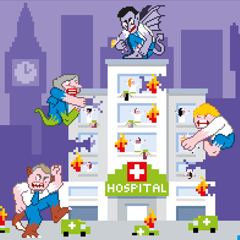
I’ve always liked political satire and satirical illustration and have fond memories of watching ‘Spitting Image’ on telly in the 1980s – the extreme (and sometimes mildly shocking) humour and visual style was exciting and cutting edge at the time. It was savage and pulled no punches.
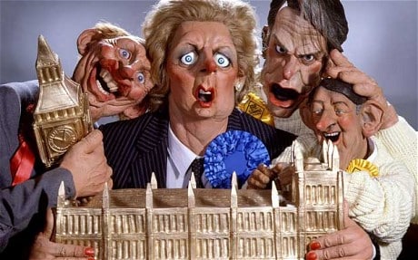
Photo from the ITV Spitting Image TV series (which ran from 1986 – 1996)
I wanted to start experimenting more with topical subjects – something I don’t often do in my illustration work, but is commonplace in my graphic design work with international NGOs, charities and other clients, dealing with social issues such as the impact of HIV/AIDS, conflict, human rights and access to health care – so I felt I had plenty of scope for choosing a subject area.
Deciding to focus on the NHS and specifically, the issue of privatisation seemed both currently topical (frankly, when isn’t it!) and something I personally felt strongly about. So with a topic decided, I then started to think about what sort of illustration I would make and which of my three illustration styles would be best suited. I decided that it would be an editorial illustration – so something that would be used in a printed magazine or online news blog. Having looked at a number of articles about privatisation of the NHS, I decided on one with a great headline title: ‘What were you doing while the NHS was being destroyed’. I also knew I wanted to use caricature – something suitable for the subject matter and also something inspired by my memories of 1980s Spitting Image TV series.
NHS Rampage!
For some reason the classic 1980s video arcade game ‘Rampage’ kept popping in my head. For those readers not familiar with ‘Rampage’ – it was a (very popular) ‘smash ‘em up’ type of game where you play a giant monster (giant ape, giant lizard, giant wolf) let lose on a city – destroying the buildings and causing mayhem – a bit like King Kong, Godzilla or those 1950s B-movies where an oversized squid or lizard turns up and tears down famous landmarks.
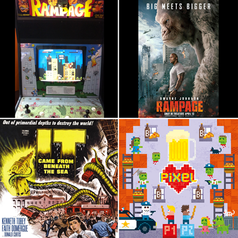
From top left to bottom right: original 1980s Rampage arcade game / Rampage movie poster / 'It came from beneath the sea b-movie poster / One of my Pixel Love Art greeting card designs.
It was usually a multi-player game so you and a group or your mates would crowd around the video arcade cabinet and each play a different monster at the same time. If you’re not familiar with the game then you may have heard of (or even seen) the recent movie ‘Rampage’ – based on the arcade game. I thought of a few different ways this could be done but I decided on using my ‘Pixel Love Art’ style of illustration, which is heavily influenced by early video and computer games.
Creating caricatures
I thought using my Pixel Love Art style would also provide some interesting possibilities for creating caricatures of politicians to feature in the illustration – turning them into the giant monsters based on those featured in the original arcade game. However, as I’d also decided that my version of Rampage was going to feature four monsters and not just the original three, I had to create a completely new monster for Health Secretary Jeremy Hunt – and for some reason decided that a vampire bat would be appropriate. I also took some serious creative liberty concerning how I interpreted the monsters as well – for example, Liam Fox, the Secretary of State for International Trade, is portrayed as a giant ‘were fox’ instead of the giant wolf featured in the original game.
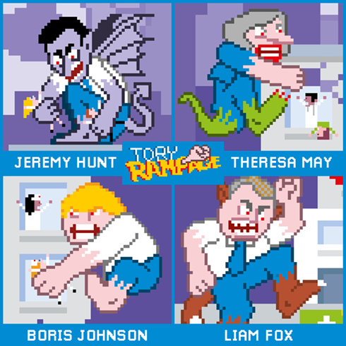
Examples of the four caricatures I created for the NHS Rampage illustration.
I also decided to focus on key Conservative politicians as the article I was using for the basis of the illustration focused largely on their policies, but also because most people’s understanding of, and experience of public service privatisation, is connected to the Conservative party. Also, privatisation policies are often thought of as specifically relating to 1980s Conservative policies – and this seemed to fit well with my decision to use the 1980s Rampage arcade game as a vehicle for the illustration.
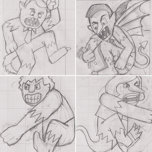
Examples of some rough initial sketches for the NHS Rampage caricatures.
Mocking up layout for editorial illustrations – why it’s useful and helps promote your work.
I created a simple mock-up of a ‘magazine’ layout for the illustration to see how they could be used in context with the article and also for some graphics that could potentially be used online as social media or blog posts. This helped to see if any further revisions were needed to the draft illustration. I decided that it did need some revisions to help it fit better in the spaces I’d made available in the article layout, and there were a number of elements I didn’t use, as well as details I chose to focus on and blow-up. For example, in one daft of the illustration I included the ghostly spectral image of Margaret Thatcher in the background to signify the legacy of 1980s privatisation policies and their continued prevalence today. However, in retrospect, I decided to drop that aspect of the illustration, as it seemed to be one element more than the illustration really needed.
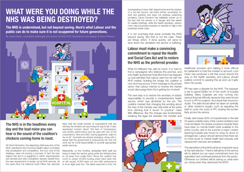
Final mock-up of the NHS Rampage illustration with the article.
For the magazine and graphic mock-ups I used Adobe InDesign – an application I’m very familiar with as I use it all the time in my graphic design work, but I also use it for laying out some of my illustrations as well. InDesign is the industry standard tool for page design layout, used for book, magazine, poster and other design layout the world over.
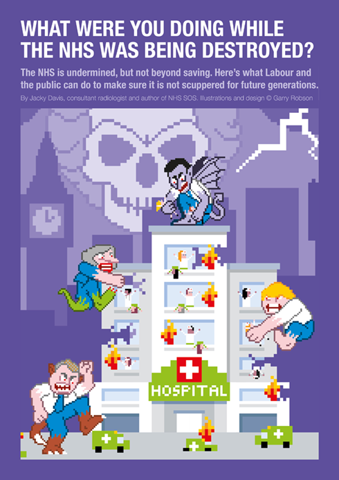
An alternative version of NHS Rampage including the spectral Margaret Thatcher in the background.
If you’re creating illustrations for your portfolio (as this NHS Rampage illustration is intended for mine), then I think it’s really important to show the illustration in context – whether it’s a book cover, magazine article, online article, product packaging or marketing material etc. This helps an illustrator really think about how their artwork can be used and is a useful exercise in developing design and concept skills. It also shows potential clients that you can illustrate for a specific format, product or purpose, rather than just creating a nice looking picture – but of course there’s nothing wrong in doing that either, but I think it really helps to think about how your artwork will be used.
Categories
Tweets from @bigillustrators and friends
Blog archive
- 2019
- 2018
- 2017
- 2016
- 2015
- 2014
- 2013
- 2012
- 2011
- 2010
- 2009
