Meeting Report
Mon 09 Aug 2010 by Siobhan_Harrison
STU HARRISON
Stu Harrison studied at Kingston. He began by introducing himself as a cartoonist and hinted at his career path having been non-linear. He has had a few studio spaces one of which being Clerkenwell Workshops, London, which had five members in a larger building which housed hundreds of creatives. One of the other studios he had was Arena in Liverpool which was the complete antithesis of Stu's current new studio which is housed in The Bluecoat Liverpool. The Arena studios were disbanded to make way for Liverpool's City of Culture 2008.The Bluecoat was refurbished as part of Liverpool's City of Culture and is now a smart central Liverpool hub for exhibitions and creativity housing several studio spaces on the second floor.
Stu has worked on Educational work, packaging, storyboards, comic strips, and a real variety of projects of every nature. Stu is always pushing forward into new areas having recently explored Licencing in a big way. He works with his wife Angela, also an illustrator, recent projects include after school clubs introducing children to Cartooning. Stu used to get a lot of Editorial work but recently there has been less and less and he has had to diversify.
Together Stu and his wife work on Style Guides another facette of the licencing area, Style Guides are then used as a bible for a particular character and are given to any design companies as a very specific guide to how that character should look. Stu has been involved in design projects from conceptualisation and visualising through to completion.Stu's particular interest is character design and brand identity. Recently Stu's Spooky Skaters has been optioned by a Manchester animation studio who do Fifi and the Flowertots and Roary the Racing Car.
Stu has had several agents including one in Japan at one point his current agent is AAReps in the States. Most of Stu's work is character design jobs, he's worked on mascots, a Nike campaign, projects for BT and a Christmas web campaign where the Art Director looked like Morrisey (The Smiths). Despite having to work with Morrisey look a likes one job of Stuarts
won a BAFTA.
Stu's clients include Kellogs. Marks and Spencers, Disney, Sony,B.T. Virgin, Orange, M.T.V. Wall's Mars, Channel 4 Asda, Clarks,
Sainsburys. Woolworths, Toys 'R' Us, and Motorola.
http://www.stu-art.biz/
SARAH COLEMAN
Sarah Coleman gave considerable thought to her six images of choice and as a result presented an unusual, intelligent and creatively revealing talk.
She has been working successfully across illustration for some time but is particularly well known for her typography work, a field she has made her own. She works with ink on paper and you can follow her on her blog, Inkymole.
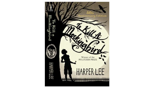
Her first image was her illustration for the recent prestigious book cover celebrating the 50th anniversary of Harper Lee's, To Kill a Mocking Bird.
Sarah grew up in a creative household, her father a keen amateur cinematographer who conveyed the importance of composing images within a rectangle. As a child Sarah was given Favourite Tales From Shakespeare, illustrated by one of my favourites, Victor Ambrus. I can see why this heady combination captured the young Sarah. Stuffed with gore and horror, she explained how the book had grabbed her from the beginning. This early and enduring influence led to Sarah eventually working as a prop maker for The Royal Shakespeare Company and productions she worked on included Wuthering Heights. A slide of a Muscha print bought by her father for her mother before Sarah was born and that always hung on the living room wall followed. This image that Sarah was daily exposed to worked a subliminal influence on her. A combination of the sensuous movement of the figure, the graphic nature of the work and the typography have all informed Sarah's work.
A very important step in Sarah's career was a job for Denby Pottery. It was a job that convinced Sarah that typography could survive on it's own merits and not just as a support to an image. As a result Sarah was in demand for work and things were going nicely when she came to a turning point. She felt she needed to prove that she was able to create a body of work that was entirely personally driven, that she could work off brief. She felt terrified without a brief but rose to the challenge and over eight months created the work for an exhibition, a collection of installations, including constructions and drawings. The exhibition showed in Brick lane and Manhatten and Sarah was pleased not only with the resulting work but also in having proved she could work to her own ideas.
The Natural History Museum recently chose Sarah as the artist responsible for their rebranding. This meant less typography and lots of detailed drawing of animals using black marker pens.It was quite a challenge but the results worthwhile and striking. Back to images which have inspired her, Sarah chose a glowing colour image by the Japanese artist Aya Kato. She was attracted by the fact that it must have taken a long time to make and there was no rushed brief to meet. The image echos the Muscha with its flowing lines and beauty, essential elements in typography and calligraphy.
In 2005, creatively frustrated, Sarah with nothing to get her going started to doodle words with no aim in mind. These were eventually developed into a decorative type which became very fashionable and brought her in lots of work.
Sarah's last slide was the work of her friend Jill Calder who also works in ink but uses much more colour and this has encouraged Sarah to branch out of black and white. This has inspired Sarah's recent work which has blossomed into colour.
http://www.inkymole.com/
ANNA KYRIACOU
Anna's work is an illustration, fine art crossover. She uses drawing to explore the way she thinks and sees the world. Her style is figurative and she uses a spare, expressive line to communicate complex ideas and feelings such as childhood bullying. Her figures, mostly children, are drawn from memory and given prominence in the drawing. There are no distracting details and the figures are given plenty of space on the page. This means the viewer is forced to focus solely and intently on the figures.
Anna relishes difficult subject matter and is interested in the fine line that exists between love and hate. This is explored in a drawing in which a line of school girls are hugging each other but on closer inspection one notices that one of the girls is holding a knife.This work which was made into a screen print won The Brighton Fringe Festival Art Prize. Anna's drawings are developed from personal experience but she prefers to draw in an intuitive way. As a result the work has an ambiguous, disturbing quality which Anna aims for.
A dislocating image, Virgin and Child, of a girl pushing a doll in a buggy is drawn with a raw expressive line, resembling the sort of drawing that a child might do. Anna very much appreciates this sort of direct and spontaneous way of drawing. In this work, Anna is subverting the idealised religious vision of Virgin and Child.
Anna's first love is painting and her fourth image was her oil painting of a girl balancing on a chair, the background of which had been worked on with copper leaf. She is influenced by images found in Greek churches and the ageing appearance of these appeals to her. She also admires Rothko and the abstract expressionists although for herself, she prefers to stay within figuration.
"The Geek's Revenge" returned to the theme of playground bulling and the duality inherent in humans to be both aggressor and victim. The theme broadened out from the personal to comment on society's current preference for celebrity culture over intelligence.
Anna felt she had to bring along some work which qualified more as illustration. She has written a children's story and worked out the character but she hasn't yet taken it to a publisher.
Anna's last image was a piece for the Boxbird exhibition, From A to B. Again it is an image of a child, this time playing at cowboys. Like all her drawings it is one which makes you look twice and think again.
http://www.annakyriacou.co.uk/
ALÉ MERCADO
Alé presented a fast paced and colourfull talk. Originally from Spain he explained that on moving to Kilkenny Ireland he found there were no illustration agencies, no illustration jobs, "Nothing."What he did find along with several fields of cows were several small print houses who would offer full solutions including design and stock imagery. He realised quickly that he would have to offer design as well as illustration. He has worked regularly for the Arts Office Kilkenny County Council and in so doing has taken projects through from start to finish including liaising regularly with local printers, building up a good relationship with them and in that way having a good amount of control over the finished product. He explained how he usually takes a proposal along and then he proceeded to describe the process which follows, of developing the project along with the inevitable changes of tack along the way.
His work at this point was dominated by a strong definite line. Alé described his working process starting with a pen and ink line which is scanned into the computer. Finding the scraper board tool in Painter revolutionised his work giving a real feel of something hand generated, similar in feel to a lino or a woodblock print.
The next milestone happened when he started incorporating more and more elements of relief printing into his digital process. This was also a revolution in terms of the amount of megabites he was using, older Photoshop files having notched up to an amazing two gig and lots of hours of rendering. With this process Alé was able to work much faster.
Alé cited several things as influences on his work a love of Music particularly "Metal" being one that he has drawn on in imagery. A love of Westerns and Comics are other influences on his style particularly noticeable in an image of a gunslinger with his middle blown straight
through so that you can see the figures beyond, through his stomach. Lovely!
Alé has worked with Theatre Companies producing promotional material for plays, he has worked on Development plans for Libraries, Film Festivals and Art's Festivals.
One of the projects he was talking about seeing through from start to finish was his "Rhyme Rag" Issue 5 an A3 poetry publication printed in a limited colour palette, this shows a good use of his strong Scraper board technique illustrating an anthology of poems along the theme of broken hearts.
Alé highlighted his talk throughout with colourful bullet points the main ones being, " Illustration cannot exist by Itself. It needs to be illustrating something, a subject and there isn't such a thing as an illustration original. Illustration is conceived from the beginning to be reproduced massively and, in most cases disposed of immediately "
http://www.flickr.com/photos/alejandromercado/4396283349/in/set-72157603856382695/
http://www.alemercado.com/
EMILY WARREN
Emily Warren is an illustrator/maker. She has been creative since a very young age and her first image was of a lively childhood drawing.
It was during her MA at St Martin's that Emily's current work first saw light. As a reaction against the sombre, detailed work of her peers, Emily in inspired mood made a bigger than life size cardboard horse. To further lighten the mood, she created a peep show inside the horse, accessed by lifting it's tail.
Emily's celebration of animals continued with the construction of a bear's head that could be wall mounted. She made this using materials associated with children's school projects, such as papier mache, cardboard, collage and glue gun. Emily's low tech approach has proved very popular and she hasn't stopped making her animals since.
I first saw them at Wickle, (wonderful bazaar of goodies in Lewes), where Emily also works. As one thing inevitably leads to another, Wickle invited her to design wrapping paper for them, which she based on her animal themes. Emily's animals have a playful and magical quality about them which reminds the viewer of theatrical props, so it was no surprise to see her construction of a toy theatre. This started out as an idea for a website. It has since been exhibited and no doubt to the delight of the audience, is allowed to play with it. Naturally it also has lights.
Emily was invited to take part in The End of the Road Festival, in which she was given a free hand to create her work and as a result was very enjoyable to do. A departure from the animal heads is a recent bird piece, lovingly painted. A photo of her messy studio shows how many processes are involved in making the pieces and how immersed Emily is in her work.
It is no surprise that Emily won the Visitors Choice Award at The Brighton Festival's Regency House Exhibition last May.
http://thestealthyrabbit.blogspot.com/
STEVE WOODGATE
Steve Woodgate from Inky Solutions, (print management company) gave a practical talk on how to get new clients and work.Founded by Steve Woodgate in 2005. Inkysolutions was born out of a passion for print.
His free booklet, Basic Marketing for Creatives, clearly and straight forwardly sets out strategies for achieving this. He also has special offers available to BIG members and are worth a check out.
Steve reinforced the importance of selective targeting when doing mail outs and to make sure the images you send are relevant. He also advised on the organisation and spacing out of a mail out campaign, (2-6 months apart) and to choose your moment carefully. You need to think about how to stand out, be interesting and different. Steve recommended reinvention through use of a pseudonym as a viable option for getting new clients. He also stressed the importance of profile brand awareness,"your style is your brand" and to use online social networking such as Linkedin and Twitter.
Steve rounded up by discussing QR, the next big online thing. QR, quick response, is a barcode system in which you are able to scan your phone over a barcode image and access information.
http://www.inkysolutions.com/
Written by Belen Gomez and Siobhan Harrison


Categories
Tweets from @bigillustrators and friends
Blog archive
- 2019
- 2018
- 2017
- 2016
- 2015
- 2014
- 2013
- 2012
- 2011
- 2010
- 2009