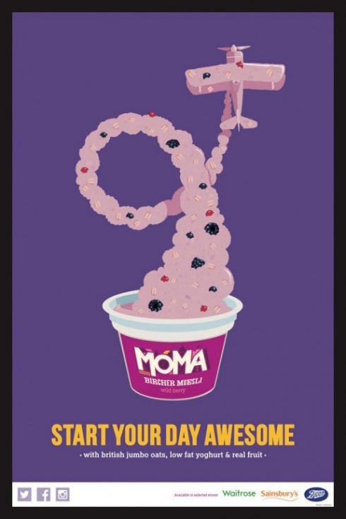
MOMA Porridge illustrations
Wed 06 May 2015 by Peter_Greenwood

Ive just completed these illustrations for Moma, It was a fun job to work on and a bit tricky to get the porridge to look like porridge but at the same time be in a recognisable shape. They are printed as a 4 sheet poster and all over the underground at the moment. The difficulty of illustrating a food substance in illustrator is quite apparent when it comes to an unusual job like this one, the first idea was a hand coming out of the pot in the shape of a "Rock" gesture to fit the tag line of "awesome". At first it worked but after I added the detail of porridge and fruit it definately looked a bit like a very bad skin complaint. The agency I worked for is called Aesop in Soho
Categories
Tweets from @bigillustrators and friends
Blog archive
- 2019
- 2018
- 2017
- 2016
- 2015
- 2014
- 2013
- 2012
- 2011
- 2010
- 2009


